Air quality is an issue that demands constant attention.
By Joey F. Ellard
There is a lot of talk about air quality these days. Whether it’s pollen count alerts in the spring, or wildfire smoke being blown into Massachusetts during the summer months from places as far away as western Canada. Air quality is an issue that demands constant attention.
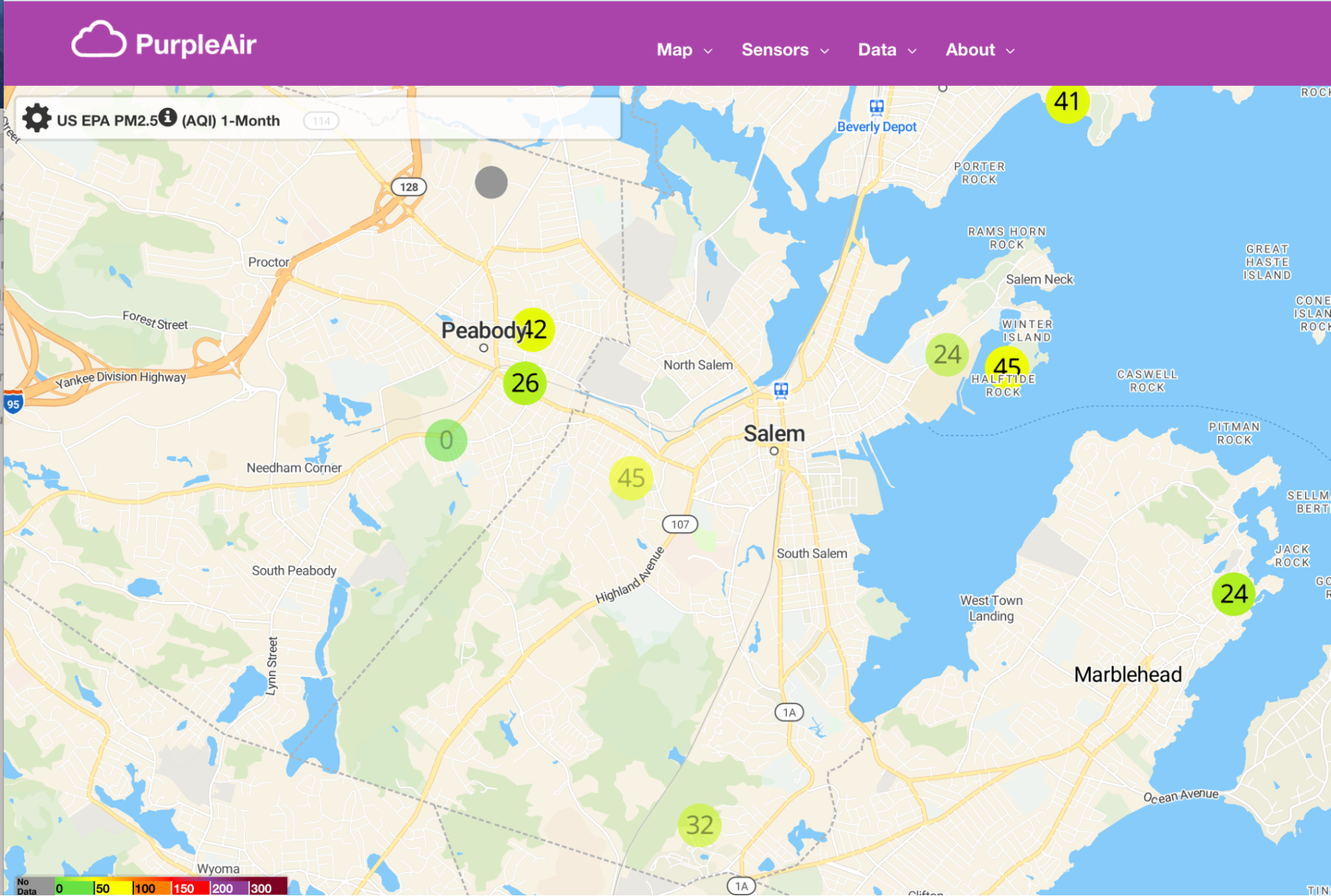
Air quality refers to the cleanliness of the air and is determined by measuring the presence of various pollutants including ground level ozone, particulate matter (like dust, pollen, dirt, soot, and smoke), carbon monoxide, sulfur dioxide and nitrogen dioxide. Tracking these pollutants is necessary to avoid diseases and complications that arise from exposure to unhealthy air. The city of Salem learned this lesson many years ago after neighborhoods were blanketed with soot and dust from a coal fired power plant located at Salem Harbor, causing well documented health effects. Currently, there are four air-quality monitoring stations spread across Salem. The data from these sensors is publicly available on the PurpleAir Map – a network of all currently operational PurpleAir monitors across the globe. These monitors collect hyper-local, real-time data on pollution levels in the air. It’s easy to collect data this way but can often be difficult or confusing to interpret the results. In order to enhance understanding of the monitoring process, we have developed a list of commonly asked questions.
Where are the monitors located?
There are four sensors located in Salem. One is installed at Gallows Hill, another on Cedarcrest Ave and two are located at the project site of the Salem Offshore Wind Terminal at Salem Harbor.

Why are the monitors located in these locations?
To ensure transparency and safety throughout the project’s construction, Crowley Wind Services, the developer of the wind terminal, installed PurpleAir monitors around the harbor. Locals can use this data to verify that city wide projects, like the Salem Offshore Wind Terminal, are mitigating unwanted impacts. As defined in our Community Benefit Agreement, Salem’s public health agent monitors this data. Placing sensors at possible pollutant hotspots is a strategic way to pinpoint the cause of air pollution.
What do the PurpleAir sensors measure?
The answer–floating particles approximately 30 times smaller than the diameter of a strand of human hair. There are all sorts of miniscule pollutants that float unnoticed through the air. These pollutants, often the result of power plant combustion or vehicular emissions, are known as particulate matter (PM). PurpleAir sensors are designed to determine the levels of different types of PM in the air. The most dangerous being that of PM2.5, a type of particulate matter that is only 2.5 micrometers in diameter. As a result of its microscopic size, PM 2.5 can be absorbed directly into the bloodstream from inhalation and is therefore typically identified as the pollutant that poses the greatest risk to human health. From asthma attacks, chest tightness, and shortness of breath in the short term to respiratory illnesses, lung tissue damage, cancer, and stroke in the long term, repeated exposure to PM 2.5 is extremely harmful.

What does it mean to have poor air quality?
There is a lot of talk about “poor air quality” but hardly ever a specific definition behind it. Currently, air quality standards are based on amounts of PM2.5 in an area. The Environmental Protection Agency (EPA) has two guidelines on acceptable levels of PM2.5, a 24-hour guideline and an annual one. As shown in the diagram below, both standards are based on the amount of micrograms of pollutant in a cubic meter of air.

The calculations behind these guidelines can be pretty confusing. Thankfully, there is a better and simpler way to understand what it means to have poor air quality–the Air Quality Index.
Air quality made simple:
The Air Quality Index is the EPA’s tool for communicating about outdoor air quality and health in a more straightforward manner. It includes six color-coded categories that each correspond to a range of index values. The color makes it easy for people to quickly determine whether air quality is reaching unhealthy levels in their community.

The higher the AQI value, the greater the level of air pollution and the greater the health concern. For example, the monthly average AQI value in Salem (based on the four PurpleAir sensors) is 59.3 and is denoted with yellow coloring. This means that Salem’s air quality may pose some risk to susceptible individuals, but for the most part is completely healthy. On the opposite side of the spectrum, recent wildfires in Canada have caused the air quality values in certain places to spike as high as 230 which is represented by the purple range. Such a color indicates major health risks to anyone exposed to the air. This color coding system converts seemingly incomprehensible information into everyday language. The AQI is an incredible tool for a concerned populace to easily identify the quality of their air.
The PurpleAir map uses this exact index to present information. Sensors gather information on the quantity of particles in an area and convert it into index values. The site lets you stay updated on present, past or predicted air quality levels at different locations around Salem. There should be no uncertainty or confusion when it comes to issues of safety. Air pollution is not going away. To create a cleaner future for the world we must start by educating ourselves on the issue. Understanding air quality is a great first step.